
- My 9980s

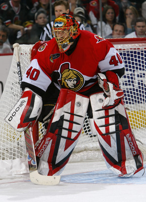
I wear a set of Sher-Wood 9980 goal pads in red, black and white very similar to what Patrick Lalime wore as an Ottawa Senator in the early 2000s.
The pads themselves are solidly crafted made-in-Canada products, but what I really love about them is the crazy v-lines in the design. It’s a peculiarly sharp combination of the symmetrical and ludicrous that results in a near-psychedelic series of line after line layered over one another. It doesn’t hurt, either, that when combined with my team the Hack HC’s ’38 Chicago Blackhawks-inspired jerseys I end up looking like a distracting test pattern of red, black and white on the ice.
My love of these pads’ look is directly opposite to the designs sported on the products put out by many of today’s top goal pad manufacturers. An uncomfortable mixed martial arts t-shirt aesthetic has crept into many brands’ signature designs. And while they’re at least falling short of making pads covered in skulls with snakes made of chain link slithering through the eye sockets, the swirls and squiggles of the modern pad often have a tribal, stabby, barbed wire feel about them.
I hate this.
But I’m just one guy, and these are multi-million dollar sporting companies with teams of marketing consultants making these design choices. I must be wrong, right? I dunno. So I tracked down a few actual working art people to find out what they thought of various modern goal pad designs.
I collected real-life pad photos of a few brands, and then went through each manufacturer’s “customizer” function for all the other pads they had in their product lines, designed pads in my team colours of red, black and white, screen capped said pads, then sent the pics out to my artists panel to see what they thought.
Meet the panel:
Jordan Stewart — Musician, writer and stage performer who also plays beer (and whisky) league hockey.
Sam Chou — Director of Animation and Creative Director of Style5.tv.
Brandy Gale — Canadian artist, photographer and bon vivant, her work can be seen at Brandygale.com.
1. Eagle Sentry

Eagle Sentry
Jordan Stewart: For the goaltender who is frustrated because he can’t find pads that match his “overly busy with no actual style” Affliction t-shirt, Sentry gives you what you’ve been craving with their “Douchebag” line.
Sam Chou: I like the black leather texture.
Brandy Gale: This is a veritable Rorschach test.
2. Bauer One100

Bauer One100
JS: Bauer saw all of the new designs coming out and decided “Let’s do that! But, ehhh, let’s stop halfway.”
SC: Besides the words “Bauer,” I can’t help but to see the word “Ki” at the bottom toe. That’s usually a martial arts term to describe a physical energy used in breaking boards, bricks and other things that can’t hit back. A crane kick with skate would be devastating.
BG: Arrows point to centre, the Ks at the bottom look like high heels, and the blanket
stitching is very arts and crafty.
3. TPS R12

TPS R12
JS: No one is watching the new Mad Magazine TV show but TPS goes “Spy Vs. Spy” with their new design anyway. Granted, both spies are black but they’re betting that no one will get the reference anyway.
BG: I saw these on Etsy.
SC: This looks like a paper cut-out. I want to put it on my paper dolls.

Brian's Focus
JS: Defying the negative press that street racing has garnered lately, Brian’s introduces “The Zippity Zap” for car detailing aficionados.
BG: Lip Service bondage pant buckles.

Brian's Pro Stock
JS: Tampa Bay Lightning owner Oren Koules made headlines when his goaltenders starting wearing masks that promoted the Saw films that he produced. Brian’s has taken the next logical step with their “torture drill” design.
SC: Rarr! I was mauled by a bear/cougar but I survived. These are my battle wounds!!!!
BG: put the flaps in the slots and make your own hockey doll.

Brian's DX2 Razor
JS: Brian’s makes a bold move by designing a pad that lets the middle aged beer league goaltender embrace his mid-’90s armband tattoo.
SC: This looks like the tribal tattoo every douchebag has on his arm.
BG: Custom made to match your tattoo armband.
7. Koho 588

Koho 588
JS: Koho also panders to the older ‘tender who may have gained a few pounds by providing a slimming vertical stripe.
SC: I like this one. Simple and graphic.
BG: For legs as thin as hockey sticks.

Reebok Larceny
JS: Reebok knows they’re the new kid on the block but they also know that branding is everything so they’ve cleverly worked elements of their logo into their pad design. If only their million dollar endorser Sidney Crosby played net… dare to dream, RBK.
SC: Bear attack number 2.
BG: Landscapes on side view.

Reebok Revoke
SC: For some strange reason, I think of basketball when I see this.
BG: Gigantic, a big big love.

Sher-Wood T95 Vintage
JS: Sher-Wood has been around for a long time but most people don’t even know that they still exist. So why not remind people that you were putting holes in blockers back when Reebok was still just putting spikes on soccer cleats?
SC: I really like this. Simple, and graphic. I would wear these to work.
BG: Minimalist.

Sher-Wood T00 MB30
SC: Tribal.
BG: For the wearer of Axe Body Spray (Sher’wood).

Sher-Wood T100 PL
JS: Sher-Wood continues their old-school references with a shocking tribute to the controversial painting Voice Of Fire by Barnett Newman, which created a Canadian taxpayer firestorm in 1990. Gutsy move, Sher-Wood.
SC: Is that the Yemen Flag? Iraqi flag? Is there hockey in Iraq?
BG: “It puts the lotion in the basket.”

Sher-Wood T100
JS: Then, when Sher-Wood had exhausted all of the retro ideas they could muster, they just gave up and allowed their CFO’s pothead son to design their final model. It was never completed.
SC: I usually like minimalist design, but this one is real boring.
14. Simmons 995

Simmons 995
SC: Wavy.
BG: These are horny.
15. Simmons UL6

Simmons UL6
SC: Wavy. But out of all the wavy ones, I like this one the best.
BG: A study in Victorian corsetry. Someone’s been boning up on their John Willie.

Simmons UL6 Iceberg
JS: Goaltending can be a stressful job but Simmons is here to let you know that your EKG is still looking strong.
SC: I like these graphic shapes. More designs should use the “shockwave.”
BG: This goes great with a Charlie Brown pullover.
17. Vaughn 7600 Velocity 4 Vintage

Vaughn 7600 Velocity 4 Vintage
JS: Taking a cue from Sher-Wood, Vaughn also realized that they had been recently forgotten and created “The Esposito” to remind people that they were around back when goaltenders stood up straight and proud… while kicking awkwardly at pucks.
SC: Simple, balanced and awesome. I would buy this one just to look at.
BG: The simplicity of these is a relief after all that tattoo flash.

Vaughn 7900 Velocity 4
JS: Vaughn was so happy about the Nashville Predators staying in Tennessee that they created a respectful Opryland tribute to the classic cowboy shirt. Who said hockey can’t work in the south?
SC: The arrows represent the aerodynamics of the pad. (Away from the crotch.)
BG: This one’s modeled on The Scream by Edvard Munch.

Vaughn 7360 Velocity 4
BG: Oooh look, a giant sperm!

JS: Vaughn separates themselves from the new-school pack by introducing their ’80s themed Qix video game pads.
SC: Wow. This one is busy. The overuse of lines and angles reminds me of the new Transformers, but better.
21. Warrior Fortress

Warrior Fortress
JS: As hockey fans in Atlanta see their team fly away to Winnipeg, Warrior puts salt in the wound by introducing pads styled after their NFL Falcons logo.
SC: Lame design. Sorry.
BG: These are my personal favourite. Even a puck bunny could wear these and look
sassy.
22. Warrior Messiah

Warrior Messiah
SC: I can’t help to to notice that this one is titled “Warrior Messiah,” which makes me picture a bad-ass Jesus ready for battle. Besides that, it’s an interesting and tasteful design.
BG: Tribal lite.

Discussion
No comments yet.